
As explained in UX Design Trends 2015 & 2016, responsive Web design has become the industry’s recommend approach for supporting multiple screen sizes and devices. But not all responsive sites are created equally.

Photo credit: PlasmaComp
Whether you’re designing a small company website or reworking an ecommerce platform, let’s explore some mistakes you definitely want to avoid on your next responsive Web design project.
Focusing on Devices Instead of Screens

The <3 of EU tech
The latest rumblings from the EU tech scene, a story from our wise ol' founder Boris, and some questionable AI art. It's free, every week, in your inbox. Sign up now!
According to data provided by OpenSignal, there are now 24,093 distinct Android devices on the market, up from 18,796 just last year (and this isn’t even counting iOS and other devices). This incredible diversity makes it impossible to target individual devices. Instead, you must focus on screens.

Photo credit: Luke Wrobelwski. Creative Commons.
Move away from popular device classifications such as:
- Wearables
- Phones
- Tablets
- Desktops
Instead, you should design for screen sizes, including
- Micro-screens
- Small screens
- Mid-range
- Large
- Extra-large
Using screen size instead of device classification for a responsive design is important as we are seeing different devices slowly creeping outside of their categories. You can no longer lump all phones into one category because of the wildly disparate sizes of their screens. There are phones available now that are larger than some of the smallest tablets as well as desktop screens that rival the size of televisions.
The device itself is no longer a clear indication of the size of the display, which is why device size can not be the sole criteria used when developing responsive breakpoints.
Focusing on screen size instead of device size is also an important step away from using only known device sizes for responsive breakpoints.
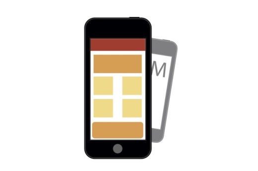
2. Using Only Device Sizes as Breakpoints
As new devices enter the market, new screen sizes will inevitably introduce themselves into the design landscape.
If you only use current device sizes as breakpoints, your site will feel strained on these newly introduced screens. To meet this challenge, you can use a method I call “building to the design, not the device.”

Photo credit: Stephanie Walter. Creative Commons
- Start with the Mobile First approach and build your site with smallest screen that’s relevant for your users . In most cases, a phone will be the smallest relevant screen size. The iPhone’s screen resolution (in portrait mode) is 320 pixels wide.
- If wearable devices are important to you, then you will need to consider micro-screens with even smaller resolutions. The Apple Watch has a width of 272 pixels, which is the smallest smartwatch outside of the Pebble Time (144 pixels wide). If you want to accommodate these micro-screens, designing for 272 pixels and above will have you pretty much covered.
- Once you establish your small screen layout, slowly scale your screen size larger.
- As your design starts to feel strained, add media queries to make any necessary layout changes so that your design is comfortable and works well every step of the way
- Continue this process until you reach the largest screen sizes you are designing for. A maximum of 2000 pixels wide will cover all but the largest displays available today. According to the latest browser statistics from W3Schools, 99 percent of visitors have resolutions that fall under that 2000 pixel size.
With this method, your responsive breakpoints are introduced based on the needs of the design, not according to known device sizes. This means that the site works well from the smallest to the largest sizes and you do not get uncomfortable in-between states that fall in the middle of known device sizes.
By building to the design, you take full advantage of the fluid nature of the Web. You create a design that truly scales to all screen sizes, both those available today and those in the foreseeable future.
3. Only Thinking Small
Despite the importance of small screens, responsive design is about more than just mobile devices. The discerning responsive designer thinks both big and small with their layouts.
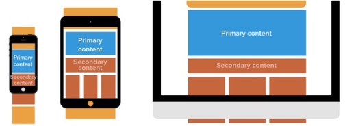
Photo credit: UXPin
Mobile Internet usage has been climbing for years. Globally, it now accounts for the majority of Internet usage, but 42% of traffic is still coming from desktop visitors. That is not an insignificant number, and a designer who only thinks small with their responsive website is, quite literally, missing the big picture.
- Treat large screens with the same level of attention you give small screens.
- Do not just scale your design up so it “fits” on those large screens. Take full advantage of the extra space you have available to you.
- Create a content hierarchy to consider key content or features in your design and make sure that they are placed appropriately in your widest screen layout.
- Make sure that images do not lose quality as they scale up for the largest sized screens.
- Be mindful of line lengths as your design scales larger. Line lengths between 45 and 75 characters are optimal. You can use a bookmarklet from Chris Coyer to test your design’s line lengths.
- Avoid scaling font sizes too large, even if you have room to do so. Fonts that are too large take up significant horizontal space, which can force readers to slow down or skip ahead in the content. Run usability tests using these large screens to check for readability.
4. Hiding Content
In the early days of mobile websites, the dominant thinking was that visitors were in a rush and were only looking for a small sample of the content that the “full site” had to offer.
Content like contact information and directions were prioritized while other content was hidden on those mobile versions. This causes a problem for anyone who wants access to all the same content and features found on the normal site, but presented in a format suitable to the screen they are using at that time.
Recent studies have shown that this “rushed mobile visitor” scenario is a myth. In fact, a recent report by InMobi found that “61% of mobile Internet users are on their device while watching TV.”
Someone sitting on their couch surfing the Web is the exact opposite of that “in a rush” scenario. Many of these visitors are “multi-device users”, meaning they are accessing the same content from different devices throughout the day. As such, they expect content to be consistent across all those devices.
The device someone is using is not enough information to determine which content they want. If content is relevant to users on one device, it should also be available on other devices and not hidden away. You might present and prioritize content differently for different screen sizes according to progressive enhancement, but never hide content itself.
5. Insisting on Consistent Navigation
Different screen sizes and device form factors require different kinds of website navigation. It’s a mistake to insist on absolute consistency across the different layouts of a responsive site.
Good example of how to modify navigation for responsive design

On the desktop view, FiveSimpleSteps uses a horizontal navigation.
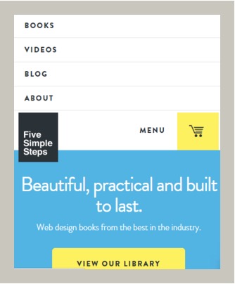
As you shrink to the smallest viewport, the navigation changes to simple “MENU” button which expands above when revealed.
When designing responsive navigation, the following items should remain consistent:
- Link or button labels
- Typefaces
- Color treatments
The following elements should not remain consistent as they accommodate the nuances of specific screen sizes:
- Button size
- Visual layout
- How the navigation works, including the differences required for touch screens. For example, a desktop navigation can sit static at the top of a screen. When you rework the layout for the mobile screen, you can make the navigation persistent and shrink in size to get out of the way.
6. Failing to Design For Touch
Different screens allow for different input methods, including touch.
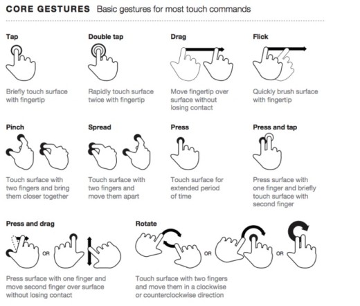
One common mistake that designers make with responsive sites is failing to design for touch functionality including:
- Using the corners: On very small screens, the lower left corner is the easiest place for users to access, most often with their thumb. On tablets, which are held differently than phones, the top corners are prime touch real estate. When designing your small screen layout, place CTA buttons or other important links in that lower left corner to ensure ease of access. For mid-range screens, which is where most tablets will fall, place these important buttons and links in those upper corners.
- Tap targets (like CTA buttons) must be adequately sized. A minimum of 44 points is usually sufficient.
- Do not place items too closely together to avoid someone accessing the wrong item by mistake. Suggested spacing to avoid interface errors is a minimum of 23pt.
- Forget about hover states. On touch screens, there is no “hover”, so ensure that any information revealed this way for non-touch screens is still accessible. You can have a tap open up the menu that would have been revealed on hover. You could also design your interface so those sub-menus are available from the start, with no tap or hover needed.
- Use natural interactions and create navigation that works well with the common hand gestures, like swiping.
7. Linking To Non-Mobile Friendly Content
The ability to easily link visitors to other pages or content, either on your site or elsewhere on the Internet, is one of the key elements that make the Web so powerful. The problem for responsive experiences is when your device-agnostic site links to other non-responsive webpages.
Sometimes, this cannot be avoided. If your responsive website links to other sites that you do not control, you will not have the ability to make those sites multi-device friendly. In these cases, you may instead want to look for an alternative site to link to.
If you are linking to sites and resources that you do control, including micro-sites or partner websites, you want to ensure that all of them provide a consistently positive responsive experience.
8. Ignoring Performance
In the free eBook Interaction Design Best Practices by the collaborative prototyping app UXPin, they address the reality that digital time and real time are not the same.

A few extra seconds may seem like nothing, but it is an eternity for someone waiting for a website to load. Responsive websites must be optimized for peak performance in order to load quickly regardless of the device or connection that those devices have to the Internet.
Some keys to optimizing for performance include:
- Limiting images to only those which are essential
- Optimizing any images used on the site
- Removing unnecessary dependencies, like Javascript libraries or other 3rd party tools
- Taking advantage of browser caching. This allows commonly used files on your website, including HTML, CSS, Javascript, etc., to be stored locally. This will speed up page load for return visitors.
- Minifying CSS will remove unneeded whitespace in your stylesheet and compress its file size for quicker downloads.
- Reducing the total number of HTTP requests. Every file or resource that a webpage needs, including each image, plus the CSS and Javascript files, requires the browser to fetch them from a Web server. The more trips to the server that are required, the slow a page loads. Reducing this number of trips is yet another way to speed up overall page load.
9. Forgetting to Test Your Design
What works in the lab does not always hold up in the real world. Running usability tests for responsive sites with real users on actual devices will allow you to uncover UX issues to resolve prior to a full release.
Even if you are short on time or budget for user testing, loading a site yourself on specific devices will at least help double check your design and development decisions.

Photo credit: UserTesting
If time and resources allow, services like UserTesting provide fantastic value for $50 a test. They’ll help recruit, create tasks, record the test, and analyze results. At the absolute minimum, you should always run your site through Google’s Mobile Friendly Test to identify potential issues.
Next Steps
To learn more about best practices for responsive design and other UX techniques, check out the free guide UX Design Trends 2015 & 2016. By analyzing 71 of today’s best UX examples, the guide deconstructs useful trends into simple design tactics.
Read Next: 10 rules of best practice for responsive design
Image credit: Shutterstock
Get the TNW newsletter
Get the most important tech news in your inbox each week.